Getting Started with SenseOn Reveal: Unlocking the Power of Your Security Data
SenseOn Reveal integrates seamlessly into your existing SenseOn platform, providing intuitive tools for data exploration and analysis.
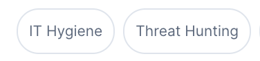
Filter your dashboard by: IT Hygiene / Threat Hunting / All
Finding and opening dashboards
Opening Reveal takes you to a landing page that lists the dashboards available to you, rather than opening a dashboard straight away. The landing page has:
- A Search dashboards box, to find a dashboard by name.
- Category chips beneath the search box, to narrow the list to a category.
- Your dashboards grouped into sections and shown as tiles: Favourites (when you have any), Security insights, and Governance & compliance (shown only when a governance dashboard is available to your tenant).
Select a tile to open that dashboard.
Favourites
Each dashboard tile carries a star. Select the star to add the dashboard to your Favourites, or select it again to remove it. Your favourited dashboards appear in the Favourites section, at the top of both the landing page and the navigation menu.
Opening a dashboard from any page
Hovering the Reveal item in the main navigation opens a menu with the same list of dashboards, along with the same search box and category chips, so you can move to a dashboard from any page without returning to the landing page first.
Returning to the landing page
When a dashboard is open, its title bar shows a Reveal › Dashboard breadcrumb. Select Reveal in the breadcrumb to return to the landing page.
Following a link to a dashboard you cannot open (one that is hidden, unknown, or has been removed) also returns you to the landing page, rather than opening a different dashboard.
Dashboards (a few examples)
Case Activity Overview
This section provides a summary of cases which have been actioned across your estate. Useful for understanding:
- Work done by the SOC
- The threat profile your company faces
- Any pending actions which require your attention
Available widgets in Case Activity Overview:
- High priority cases over time
-
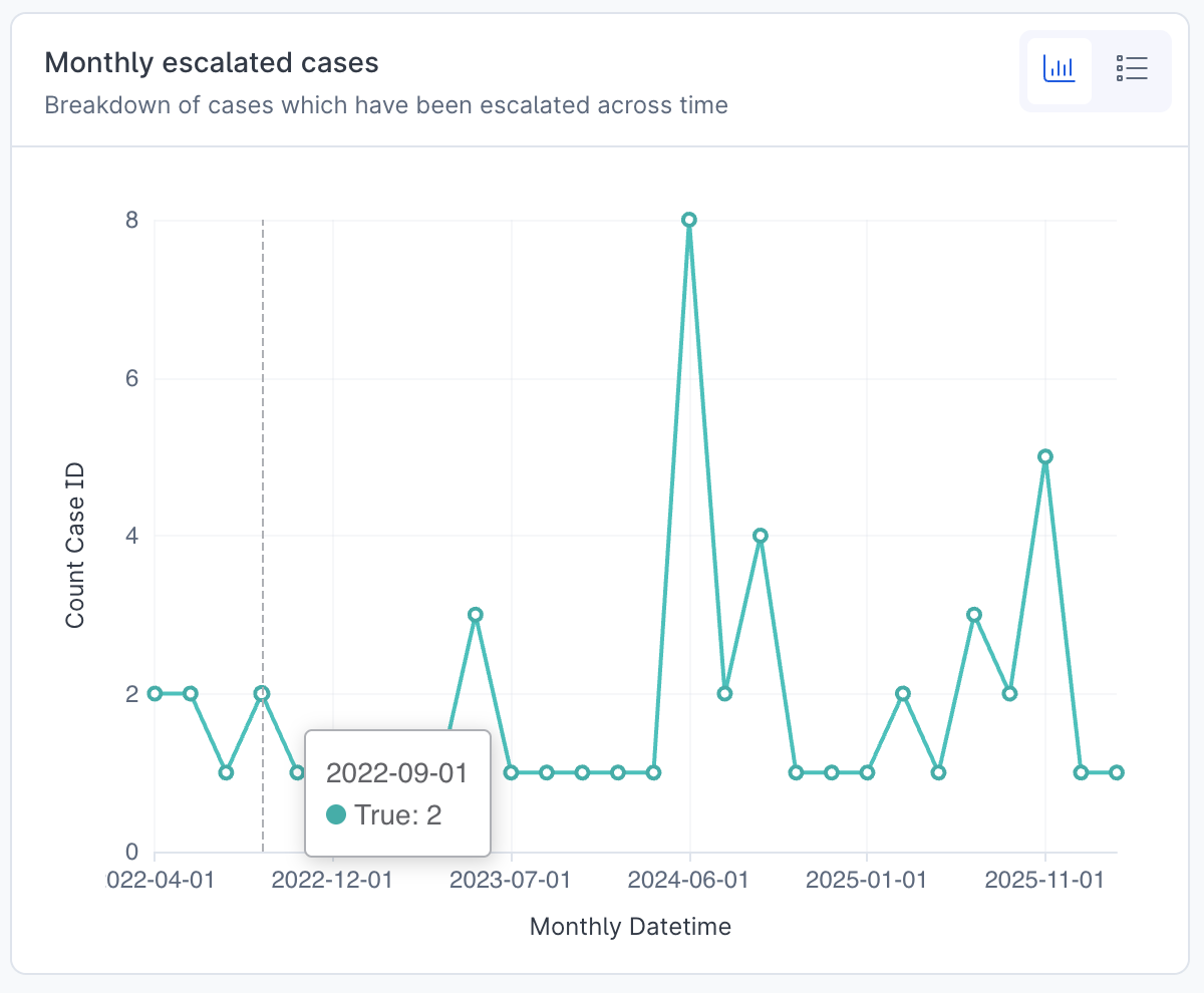
Monthly escalated cases
-
Risky Users
- MITRE Tactics
- Common processes found within high priority cases
- Total Count Case by Case Severity
- Number of high priority cases by status from the last 30 days
- Threat status of resolved high priority cases over past 30 days
- Data transfer within high priority cases
- Number of high priority cases by device type
Device and User Insights
Gain comprehensive visibility into your device ecosystem and user behaviours with detailed risk metrics and anomaly detection. This tab highlights:
- Health status and compliance levels across your estate
- User activity patterns with flagged high-risk behaviours
- Potential security vulnerabilities requiring immediate attention
Available widgets in Device and User Insights:
- Operating Systems
- Operating systems across the estate past week
-
Least commonly installed program versions
-
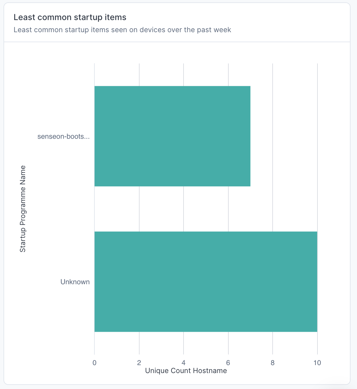
Least common startup items
-
NTLM Failed Authentication Attempts
- Failed Kerberos Authentication Attempts
- Escalated cases by device user
- File Sharing Programs
- Vulnerable Potentially Unwanted Programs (PUPs) Installed
- VPN Applications
- Remote Access Tools
- Risky Users
- Files in Use Containing Passwords
Data Transfer Overview
Visualise and analyse all data movement within and beyond your network perimeter. This intelligence helps you:
- Identify unusual data transfer volumes or destinations in real time
- Monitor sensitive data flows across geographic boundaries
- Detect potential data exfiltration attempts through pattern recognition
Available widgets in Data Transfer Overview:
- Total Daily Upload Volumes
-
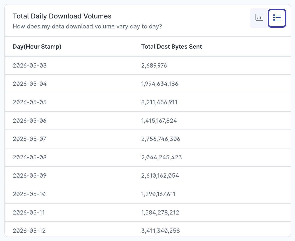
Total Daily Download Volumes
-
Data Transfer by Country (Destination Host)
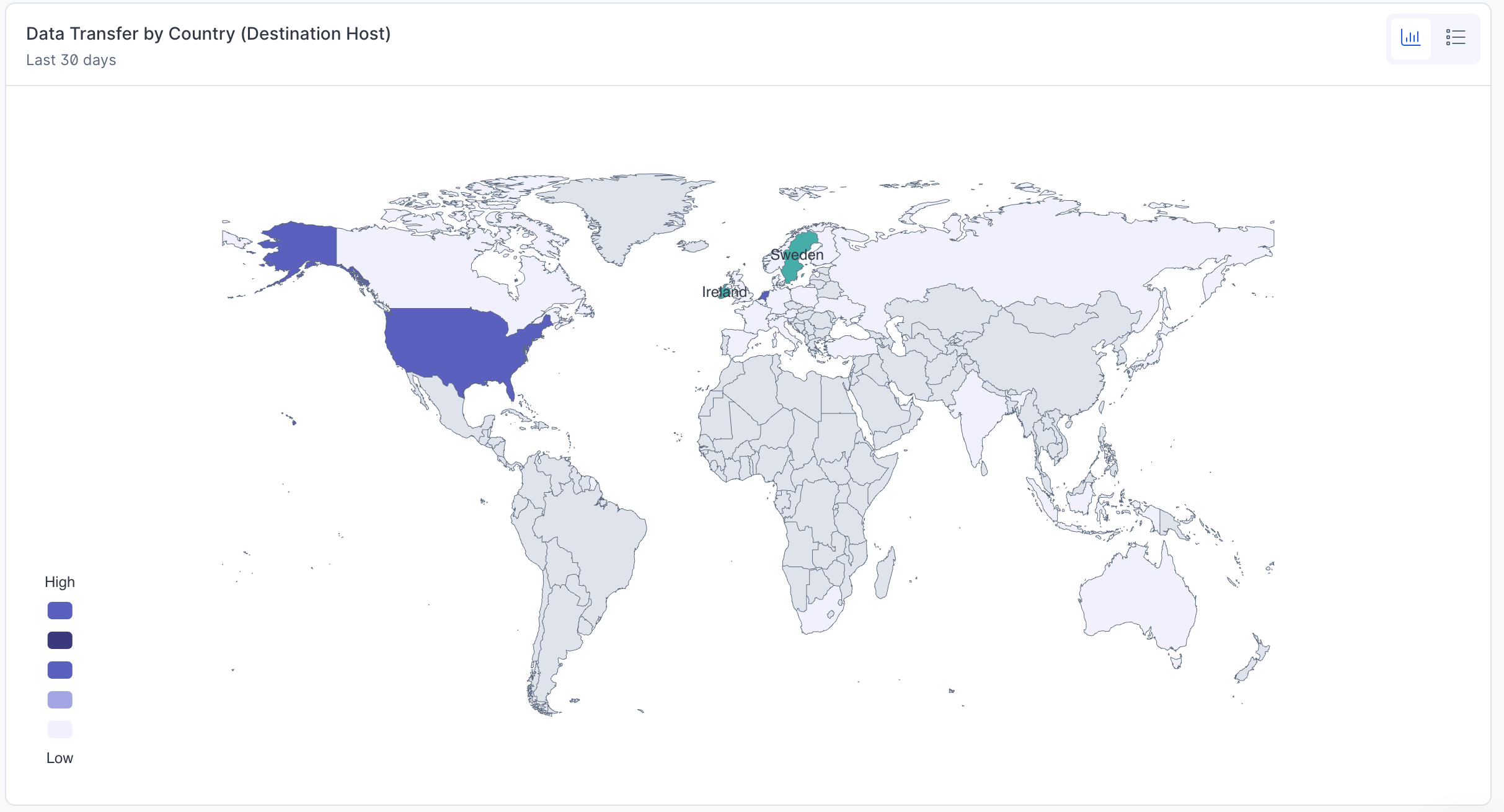
-
Devices downloading most data
- Devices sending the most data
- Users downloading most data
- Users sending the most data
- File Sharing Programs
AI Governance
The AI Governance dashboard shows AI application and service usage across your estate, by device and user. It is listed under Governance & compliance on the Reveal landing page and appears under the IT Hygiene filter. It has two tabs: Overview, for AI usage seen on your devices and network, and Accounts, for the seats your organisation holds with AI providers.
Beta: The AI Governance dashboard is available to every tenant and is in beta. Its header shows a Beta tag; hovering the tag reads "This feature is in beta. Features, availability and pricing may change before general release."
How SenseOn detects AI use
SenseOn identifies an AI application with three detection methods:
| Detection method | How it identifies an AI application | Platforms |
|---|---|---|
| Network traffic | The hostname the device connects to over an encrypted (TLS) connection. | All devices with the Universal Sensor |
| Running process | The name of the process running on the device. | All devices with the Universal Sensor |
| Installed app | The device's software inventory. | Windows and macOS only, as Linux devices do not report software inventory |
An AI application used only in a web browser has nothing installed on the device, so the Installed app method cannot see it. Network traffic still can.
Each usage widget on the Overview tab draws on one detection method, shown by an indicator in its header. Hover over the indicator to see the method and the AI applications it can currently identify. The figures in that widget only cover what its method can see. The AI applications detected by detection method widget covers all three methods, and the Accounts tab uses data from your AI providers rather than these methods.
Which AI applications are covered
The dashboard recognises AI applications from a list that SenseOn maintains and checks, rather than flagging anything that looks like AI. The AI applications detected by detection method widget shows the current list. Select it to expand a table with one row per application and a column for each detection method, where a tick means that method identifies the application. This widget shows SenseOn's detection coverage, not activity in your estate.
Keep these points in mind when reading the dashboard:
- Tools not on the list do not appear. An AI tool that SenseOn does not yet recognise is not counted, even if your devices use it. If you need a tool added, ask the SenseOn SOC through the Support Hub.
- New tools are not added retrospectively. Usage is matched to AI applications as each day's data is summarised. When SenseOn adds an application to the list, it appears from the day the update reaches your environment, and earlier activity is not shown.
- Usage history starts when the dashboard was enabled. The usage widgets cover the last 7 or 28 completed days, and only from the point the dashboard's data started being collected for your tenant.
For a one-off look further back, or at a tool that is not on the list, the SenseOn SOC can run a hunt across your raw network and DNS records in Hunt Lab.
Why the figures differ from Microsoft Defender
If you also use Microsoft Defender for Cloud Apps, it will usually report more AI applications than SenseOn. The two products count differently:
- Defender matches activity against Microsoft's own catalogue of several thousand cloud applications. SenseOn uses its shorter, curated list.
- Defender can count a visit to a web page that loads an embedded AI feature, such as a chat or text-to-speech widget, as use of an AI tool. SenseOn counts connections to AI services and AI applications running or installed on your devices.
For the widely used AI applications, the two products should broadly agree. Most of the gap comes from tools outside SenseOn's list and from embedded web widgets.
Overview tab
| Widget | What it shows | Detection method |
|---|---|---|
| AI applications detected by detection method | The AI applications SenseOn can detect, and which methods identify each one. | All three |
| AI services reached (7d) | AI services your devices reached over encrypted connections, ranked by how many devices reached each one. Because this comes from network traffic, it includes services your organisation has no account with. | Network traffic |
| Top AI users (7d) | Users ranked by the number of connections their devices made to AI services. Usernames are local operating system accounts, so they may not match the person's cloud or corporate identity. | Network traffic |
| Deliberate versus background AI use (7d) | Devices reaching AI services each day, split by whether the traffic came from a dedicated AI application, a browser, or AI features built into other applications such as Microsoft Office. A device can appear on more than one line, so the lines should not be added together. | Network traffic |
| AI applications in use (28d) | AI applications that ran on your devices, ranked by how many devices ran them. Each device is counted once per application. | Running process |
| Code pushed by AI applications (28d) | How many times AI applications ran git push from the command line. This counts attempts rather than successful pushes, and excludes editors and graphical clients that do not call git directly. |
Running process |
| AI applications installed (28d) | AI applications found in your devices' software inventory, ranked by how many devices they are installed on. | Installed app |
| Data uploaded per AI service (28d) | Data sent to each AI service, split by whether it came from a browser or an installed application. Data is counted when a connection closes. | Network traffic |
SenseOn can only identify which application generated AI traffic on Windows devices. Traffic it cannot attribute is shown as Unattributed rather than hidden.
Accounts tab
The Accounts tab reports the seats your organisation holds with connected AI providers, such as Anthropic and OpenAI. A seat is one account a person holds with one provider, so a person with accounts at two providers counts as two seats. Use it to find unused seats you could reclaim and to review who holds admin access. It is an IT hygiene report, not a source of cases or detections.
The tiles are only populated for AI providers you have connected. If no provider is connected, every tile is empty, which does not mean seats were checked and found unused. With a provider connected, Dormant seats (28d) can still be empty if that provider does not share usage data.
- Seats by provider (28d) lists every seat on your enterprise account with each provider, whether or not anyone used it in the last 28 completed days. Personal accounts are not counted. Its columns are Seats held, Active (28d), Dormant, Never used, Hold admin and What can we see.
- Dormant seats (28d) lists seats with no activity in the last 28 completed days, longest unused first. One person can appear more than once if they hold seats with more than one provider.
- Seats with admin roles lists seats holding an administrative role with each provider. Role names are each provider's own wording. These are admin roles at the AI provider, not SenseOn's own Admin role.
Providers share different data with SenseOn. Anthropic shares what people actually do in the product. OpenAI only reports when a seat is created, changed or removed, never whether it is used. For that reason Active (28d), Dormant and Never used are only filled in for providers that share usage, and only those providers appear in Dormant seats (28d). The What can we see column states what each provider shares. The Total row only sums Seats held, the one figure every provider reports the same way.
Producing an AI usage report
To report on AI use across your estate:
- Open Reveal and select AI Governance under Governance & compliance.
- Review the Overview tab. Top AI users (7d) and AI applications in use (28d) answer most "who is using what" questions.
- Use Download data as CSV on each widget you want to include. See Download widget data as CSV for what the file contains.
Remember that each Overview usage widget only covers the AI applications on SenseOn's list, over its own time window, and through its own detection method. State this alongside any figures you share.
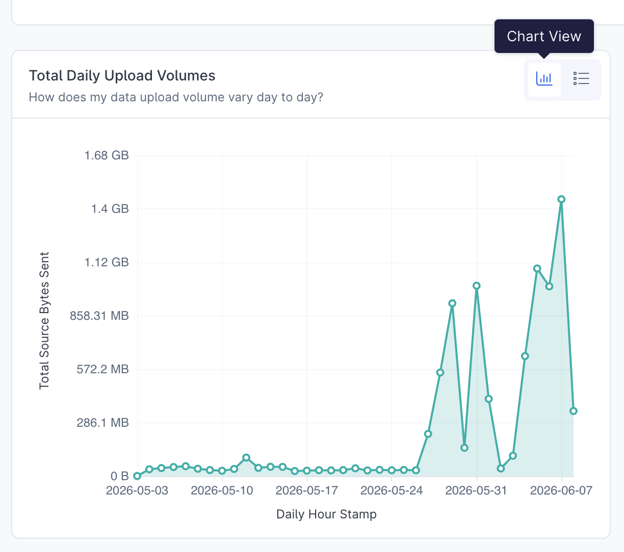
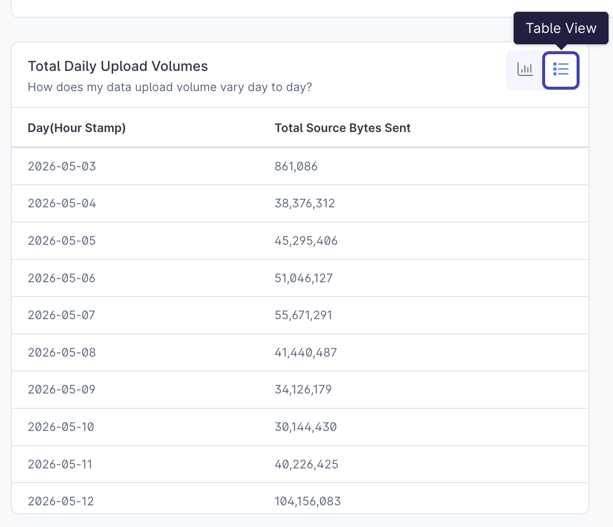
1 data, 2 views
Two view options are available for each widget: chart or table view.
Changing a chart's aggregation, sort or time bucket
On a bar, column or line chart, an axis label whose axis has choices to offer becomes a button with a chevron. Select it to open a menu, with the option in force marked. Which menu you get depends on the axis:
- Aggregation, on the value axis, changes how the measure is summarised: Sum, Average, Minimum, Maximum, Count or Unique count. Only the aggregations that suit the measure are listed.
- Sort, on a category axis, orders the chart by its values: Ascending or Descending.
- Time bucket, on a time axis, changes the period each point covers: Hourly, Daily, Weekly or Monthly. A time axis offers this in place of a sort, because a time series is read in time order.
Choosing an option re-runs the widget with that change. It applies to your current view of the widget and is not saved to the dashboard. An axis label without a menu has no choice to offer for that axis.
Case titles when breaking down by case
When you break down a widget by case, Reveal shows each case's Case Title beside its Case ID, so you can tell the cases apart without opening each one.
- In chart view (bar, column, stacked column and pie), the case title labels the category, on the axis or the slice. Hovering a bar, column or slice shows its Case ID in the tooltip, beneath the title.
- In table view, a Case Title column sits directly after the Case ID column.
- The CSV download follows the table, so it carries both columns.
Selecting a case still acts on its Case ID, so drilling in, cross-filtering and View case in Experience are unchanged.
Paging through table rows
In table view, a widget pages through its rows rather than scrolling within the tile. When there is more than one page, a footer beneath the table reads Rows X to Y of N alongside a pagination control for moving between pages. A table that fits on a single page shows neither the row count nor a pagination control.
On a dashboard, each tile fits as many rows to a page as its height allows, so a taller tile shows more rows per page. Paging is display only: it changes which rows are on screen, not the underlying data, its sort order or any filters you have applied.
Exploring the Other slice on pie charts
Where a pie chart groups its smaller categories into a single Other slice, you can select that slice to expand it in place. The pie then shows the slices that Other grouped, and a breadcrumb row appears above the chart: All slices followed by Other (N slices). Select All slices, or the ✕ button beside it, to return to the full pie.
A long tail opens a level at a time. When an Other slice holds many slices of its own, expanding it shows the largest of them and rolls the rest into a fresh Other slice, which you can expand again. Each level adds a crumb to the breadcrumb row, for example All slices › Other (996 slices) › Other (994 slices). Select any earlier crumb to step back to that level.
If one of your own categories is itself named "Other", the breadcrumb instead reads Other (grouped) for the synthetic slice, to keep the two apart.
Pie charts only group measures that can be added together. A pie of a measure that does not sum across categories, such as a unique count, an average, a minimum or a maximum, shows its categories without an Other slice.
Expanding the Other slice is display only: it does not change the underlying query, the table view or the CSV export.
Paging through chart bars
In chart view, a bar or column chart pages through its bars, in the same way the table view pages through its rows, rather than dropping everything past a fixed limit. Each chart draws a set number of bars per page, and when there is more than one page, a footer beneath the chart reads Bars X to Y of N alongside the same pagination control the table view uses. A chart that fits on a single page shows no footer.
Every page is drawn on the same value axis, sized to the chart's largest bar, so a later page is directly comparable with the first. Paging is display only: it changes which bars are on screen, not the underlying data, its sort order or any filters you have applied, and the table view and CSV download still carry every row. Re-running the widget, for example after a drill or a cross-filter, returns to the first page.
Exploring the Other group on Sankey charts
A Sankey chart keeps its largest flows and groups the remaining smaller flows into a single Other node on each side, shown in grey, so the total volume drawn is unchanged. Hovering Other lists its largest grouped flows.
Select an Other node to expand the grouped flows in place. A breadcrumb row appears above the chart: All flows followed by Other (N flows). Select All flows, or the ✕ button beside it, to return to the full chart.
As with the pie chart's Other slice, expanding is display only: it does not change the underlying query, the table view or the CSV export.
When a chart shows only the first results
Each chart fetches up to a fixed maximum number of rows. When a pie, bar, column or Sankey chart's data comes back at that maximum, more rows may exist than were fetched, and a line appears beneath the description: Only the first N results are included. More exist.
This matters most where the chart groups a long tail: its Other slice, Other node or paged bars then account only for the rows that were fetched, not for everything beyond the limit. The table view and the CSV download read the same fetched rows, so they are bounded the same way. To concentrate on the rows you need, narrow the widget with a drill or a cross-filter.
A widget whose own definition already asks for a set number of results, such as a top 10 or bottom 10, is not flagged, because that cut is intended.
KPI tiles
A KPI tile shows a single headline figure. When the tile has a time series, it reads as the latest value with its period beside it, for example 184 in Sep 2026, above a small sparkline of the series along the foot of the tile.
Beneath the value, the change from the previous period reads as an arrow and percentage together with the period it is compared against, for example ↓ 13% vs Aug 2026 (212). The arrow and percentage are green when the change is good and red when it is bad, judged per tile: for most tiles a rise is good, but for a tile where lower is better a fall is the good direction. When the value is unchanged, the tile reads No change.
A KPI tile without a time series shows the value on its own, with no period, change or sparkline.
Download widget data as CSV
Alongside the chart and table view toggles, the controls for each widget include a Download data as CSV button (the download icon). Selecting it saves the current data for that widget as a CSV file.
The file contains every row the table view holds, not only the page currently on screen, in the same column order and using the column names the dashboard defines. Anything you have applied to the widget, such as drilling into a data point or a cross-filter, is reflected in the export, so a drilled widget downloads its drilled data. The file is named senseon_reveal_<widget-title>.csv, and a confirmation appears once the download starts.
Opening a case in Experience
Case Activity widgets such as Total Count Case by Case Severity count cases rather than listing them. Because a case's identifier is treated as an attribute, you can break a widget down by Case ID to turn a count into the individual cases behind it, then open any one of them.
To move from a case count to a single case:
- Select a data point on a Case Activity widget (for example a severity bar) to open its data point menu.
- Choose Break down, then select Case ID. The widget re-runs as a list of the case IDs that make up that data point.
- Select a Case ID value to open its data point menu, then choose View case in Experience.
View case in Experience opens that case in Experience, filtered to the selected case ID over all time so that an older case is not hidden by a fixed time window. The item appears only on a populated Case ID value, not on a count of cases, and not on an empty or Unknown value.